There is no knowledge that is not power
We are, no doubt, living some of the most exciting days of the Information Age. Computers keep getting faster, smartphones are ubiquitous. Huge amounts of data are created daily by amazingly diverse sources. It is definitely easier than ever to gather data for language services buyers and providers, but it looks like the localization industry is really not doing a lot to harness all this information. Overall, and with a few exceptions, of course, the industry seems to be missing out on this and is not fully leveraging, or at least trying to understand, all these wonderful bits and pieces of information that are generated every day.
Perhaps the issue is that too much information can be hard to make sense out of and may even feel overwhelming. That is, precisely, the advantage of data visualization.
In this series of articles, I will cover three different tools you can use to visualize your translation quality data: Tableau, TAUS DQF, and Excel. This article is part 1 and will only focus on general information and Tableau.
The case for data visualization
Perhaps the single most important point of data visualization is that it allows you to assimilate information in a very natural way. An enormous amount of information that is difficult to take in when in a table suddenly makes sense when presented and summarized in a nice chart. Patterns and trends may become easier to spot and, sometimes, even obvious. Correlations may pop up and give you much-needed business or strategic advantages, allowing you to effectively act on your information.
How does this apply to translation and localization practices? Well, there simply is a lot of information you can measure and analyze, for example:
- Productivity
- Vendor performance
- MT system performance
- Tool performance
- Financials
- Process efficiency, etc.
At eBay, we use data visualization to track our vendors’ performance, the quality of our MT output for different language combinations, details on the types of issues found in our MT output, what types of issues we are finding in our vendors’ deliverables, and more.
The Keys
Let’s take a minute to examine what is necessary to make a visualization effective. I’m by no means an expert on this subject, you’ll notice, but based on my experience and research, these are the key points to consider:
First of all, be clear. What are you trying to find out with a chart? What do you want to bring the attention to? What are you trying to say? Transmitting a clear message is a priority.
Be selective: don’t cram columns and lines in a visualization just because. Carefully plan the data points you want to include, assessing if they contribute or not to the main purpose of your message. This can be difficult, especially if you have too much information – you may feel tempted to add information that might not add any value at all.
Keep your audience in mind, and be relevant. Shape your message to answer the questions they may have. Discard any information they may find unnecessary. Project managers may be interested in financials and the percentage of on-time deliveries, and engineers on process efficiencies, while language managers may be focused on quality and language performance.
Put some thinking on what’s the best way to represent the information and how you can make the most important information stand out. It’s usually a good idea to include trends, highlight patterns, and make meaningful correlations obvious.
Tableau
Tableau is perhaps one of the most popular visualization programs available. The concept is simple: Tableau can read your data, from a simple Excel file or a database (among several other options), parse it, and turn the information into dimensions and measures. And here’s the best part: you can simply drag and drop those dimensions and measures onto columns and rows, and Tableau will generate charts (or views, as they like to call them) for you. Automatically. Effortlessly.
And it comes with an amazing range of chart options and customization options that may seem overwhelming when you start using the software but, once you get the hang of it, make total sense.
Let’s look at some examples:
- This chart shows in a very simple way how vendors are performing for each of the two content types we are working with at the moment, that is, titles and descriptions. It becomes evident that Vendor 2 may be the best option for descriptions while Vendor 5 is underperforming when it comes to titles.

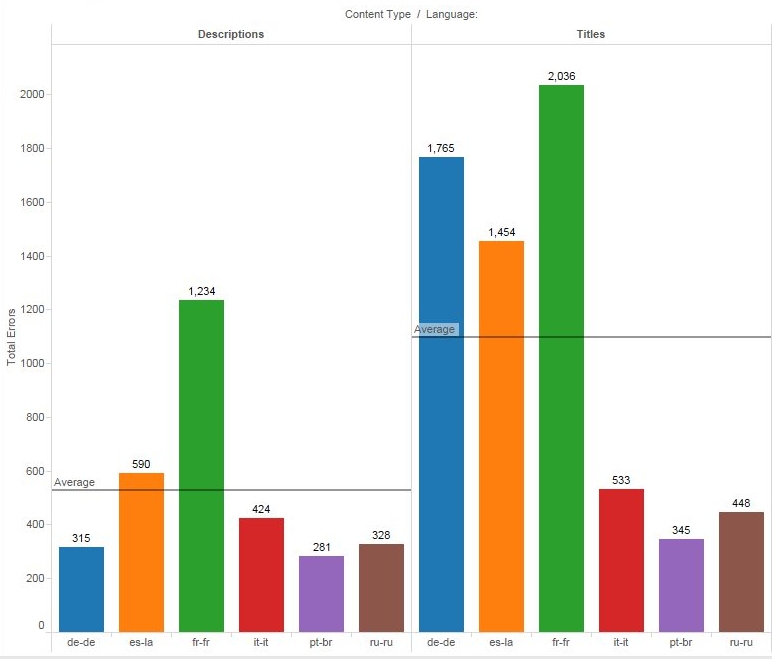
- Now, let’s imagine we want to analyze how post-editors for the different languages are doing, again based on the content type. We can take a look at how many errors reviewers found for each of them.

Here it becomes evident that German post-editors are doing great with descriptions, but they are struggling with titles, as there’s a big difference in the position of the blue columns. We can also see that Spanish and French seem to be above the error average. Italian, Portuguese and Russian don’t show major changes from one content type to the other.
-

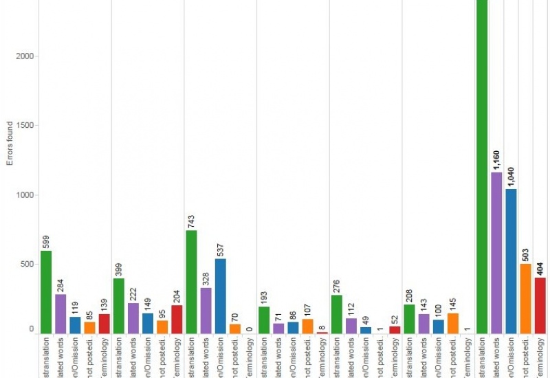
- Now we want to dig deeper into the errors our reviewers are finding, and for that, we are going to look at the different types of errors by language. Looking at this chart, it seems like the biggest problem are mistranslations. This is a good hint to try to find out why is this happening: Is the source too complex? Are post-editors not doing enough research? Are we providing the right reference material? On the other hand, data seems to indicate that terminology is not really a big problem. We could infer that our glossaries are probably good, our tool is showing the right glossary matches, and our translators are subject matter experts.
We can also see that French has many more issues than Italian, for example.

Tableau will easily let you swap your columns and rows to change the way the data is presented. In the example below, the focus is now on error categories and not on the number of errors found. However, what I don’t like in this view is that the names of the error categories are vertical and are hard to read — it is possible to rotate them, but that will make the chart wider.
There are plenty of options you can try to create a view that shows exactly what you want, in the best possible way.

- Here’s a very simple one to quickly see what are the busiest months based on the number of words processed.

- Now we want to look at edit distance — analyzing this information can help us figure out, for example, MT performance by language, considering that a low edit distance indicates less post-editing effort. I’m going to include the wordcount, as well, to see the edit distance in context.
I can ask Tableau to display the average edit distance for all languages by placing a line in the chart.
The blue dots indicate that German is the language with the lowest edit distance, with an average of 21.15. This may be an indication that my DE output is good, or at least better than the rest of the languages. The red dots for Italian are all over the place, which may indicate that the quality of my IT MT output is inconsistent — just the opposite of Portuguese, with most purple dots concentrated in the center of the chart.

- In this final example, let’s assume we want to see how much content our reviewers are covering; ideally, they should be reviewing 50% of the total wordcount. Here we can see, by language, how many words we’ve processed and how many were reviewed. You can quickly see that the wordcount for French doubles the Russian wordcount. You can also easily notice that the FR reviewer is not covering as much as the rest. This may indicate that you need another reviewer or that the current reviewer is underperforming. Compare this to Portuguese, where the difference between total words and reviewed words is minimal. If we only need to review 50% of the content, PT reviewer is covering too much.