Background
eBay is one of the world’s largest and most vibrant marketplaces with 1.1 billion live listings every day, 169 million active buyers, and trillions of rows of datasets ranging from terabytes to petabytes. Analyzing such volumes of data required eBay’s Analytics Data Infrastructure (ADI) team to create a fast data analytics platform for this big data using Apache Kylin, which is an open-source Distributed Analytics Engine designed to provide a SQL interface and multi-dimensional analysis (OLAP) on Hadoop supporting extremely large datasets.
Apache Kylin creatively applies data warehouse OLAP technology to the Hadoop domain, which makes a query return within milliseconds to seconds against datasets in the PBs. The magic of Apache Kylin is that it pre-calculates the metrics against defined dimensions. So when a query is launched, it doesn’t need to scan PBs worth of source data, but instead it scans the pre-calculated metrics, which is much smaller than the source data to accelerate the query speed.
Currently there are hundreds of cubes running on the Kylin production environment within eBay, serving dozens of Business domains in Inventory Healthy Analysis, User Behavior Analysis, eBay APIs Usage Analysis and eBay Business Partner Channel Performance Analysis, etc.
This post showcases the creative visualization of OLAP cuboids that has been implemented in the Cube Planner feature built on Apache Kylin by eBay’s ADI team to solve the challenge of showing huge OLAP cuboids in a fixed space. To better understand the challenge as well as the value of the visualization of sunburst charts that have been introduced into OLAP cuboids, some basic concepts need to be covered.
Basic Concepts
An OLAP cube is a term that typically refers to multi-dimensional array of data [1][2]. OLAP is an acronym for online analytical processing [3], which is a computer-based technique of analyzing data to look for insights. The term cube here refers to a multi-dimensional dataset, which is also sometimes called a hypercube if the number of dimensions is greater than 3.
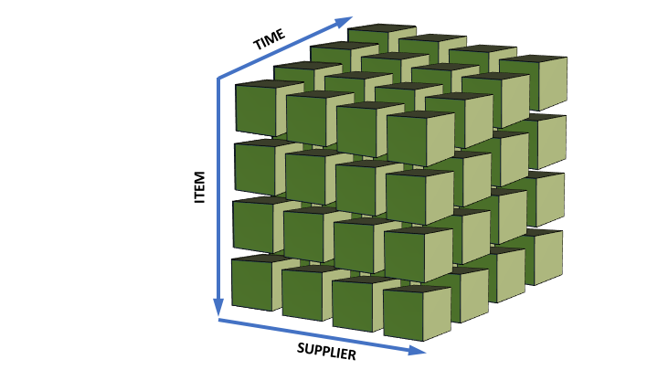
A cuboid is one combination of dimensions.
For example, if a cube has 4 dimensions — time, item, location, and supplier — it has 16 cuboids, as shown here.

A basic cuboid has the most detailed data, except for the source data itself; it is composed of all dimensions, like (time, item, location, supplier). It can be rolled up to all the other cuboids. For example, a user can roll up the basic cuboid (time, item, location, supplier) along dimension “supplier” to cuboid (time, item, location). And in this case, the basic cuboid is the Parent Cuboid, and a 3-D cuboid (time, item, location) is a Child Cuboid.
OLAP Cuboids Visualization Challenges
The OLAP cuboids visualization has the following characteristics:
- All the cuboids have a root parent — the basic cuboid.
- The relationship “rollup to” between two cuboids is directed, from parent to child.
- The relationship “rollup to” is m:n mapping. One parent cuboid can be rolled up to multiple child cuboids, while one child cuboid can be rolled up from multiple parent cuboids.
So the visualization of cuboids is typically a directed graph. But, in the real OLAP world, not all the relationships are kept. The m:n mappings are simplified to 1:n mappings. Every child cuboid would have just one parent. Usually we keep the relationship with the parent, who has lowest row count, and eliminate others, because the lowest row count of parent cuboid means the lowest cost of aggregation to the child cuboid. Hence, the visualization of cuboids is simplified to a tree, where the basic cuboid is the root, as shown below.

Even with the simplified relationships between cuboids, there can still be some challenges to cuboids layout with a tree:
- The tree must be collapsed to fit in a fixed space.
- It is impossible to have an overall view of all cuboids.
- Multiple clicks are needed to the target node from root layer by layer.
- It’s hard to focus on the whole view of all the child cuboids from a given cuboid.
Cuboid Visualization Solution in Cube Planner
Cube Planner makes OLAP cubes more resource-efficient. It intelligently builds a partial cube to minimize the cost of building a cube and at the same time maximizes the benefit of serving end user queries. Besides, it learns patterns from queries at runtime and dynamically recommends cuboids accordingly.
In Cube Planner, we want to show query usage down to the cuboid level, which enables the cube owner to gain more insight into their cubes. We want to have a color-coded heat map with all cuboids in one view to give the cube owner an overall feeling of its cube design. Furthermore, when the user hovers over each cuboid, details of individual cuboid — cuboid ID, query count, row count, rollup rate, etc. — would be displayed. We will also recommend a new cube design with recommended cuboids based on the query statistics, thus we will need to put the old cuboids and new cuboids together in one page to show the benefit of cube optimization.
We are not able to use any tree or directed graph component to meet all our requirements above. Luckily, our GUI engineer discovered a means to produce sunburst charts, which greatly meet our expectations.
What is a Sunburst Chart?
Our sunburst charts are created with Angular-nvD3, an AngularJS directive for NVD3 re-usable charting library (based on D3). Users can easily customize their charts via a JSON API. Go to the Angular-nvD3 quick start page if you want to know more about how to include these fancy charts in your GUI.
How Are Sunburst Charts Used for Cube Cuboids Visualization?
Basically, at the back end we create a REST API to return the cuboid tree with the necessary information, and at the front end a JavaScript controller parses the REST response to a relative JSON format and then renders the sunburst chart. Below are samples of code from these two layers.
REST Service returns the Cuboid Tree response
@RequestMapping(value = "/{cubeName}/cuboids/current", method = RequestMethod.GET)
    @ResponseBody
    public CuboidTreeResponse getCurrentCuboids(@PathVariable String cubeName) {
        CubeInstance cube = cubeService.getCubeManager().getCube(cubeName);
        if (cube == null) {
            logger.error("Get cube: [" + cubeName + "] failed when get current cuboids");
            throw new BadRequestException("Get cube: [" + cubeName + "] failed when get current cuboids");
        }
        Map<Long, Long> cuboidList = Maps.newLinkedHashMap();
        try {
            cuboidList = cubeService.getCurrentCuboidStatistics(cube);
        } catch (IOException e) {
            logger.error("Get cuboids list failed.", e);
            throw new InternalErrorException("Get cuboids failed.", e);
        }
        CuboidTree currentCuboidTree = CuboidTreeManager.getCuboidTree(cuboidList);
        Map<Long, Long> hitFrequencyMap = getCuboidHitFrequency(cubeName);
        Map<Long, Long> queryMatchMap = getCuboidQueryMatchCount(cubeName);
        if (currentCuboidTree == null) {
            logger.warn("Get current cuboid tree failed.");
            return null;
        }
        return cubeService.getCuboidTreeResponse(currentCuboidTree, cuboidList, hitFrequencyMap, queryMatchMap, null);
    }
The JavaScript controller parses the REST response to create the sunburst chart
// transform chart data and customized options.
    $scope.createChart = function(data, type) {
        var chartData = data.treeNode;
        var baseNodeInfo = _.find(data.nodeInfos, function(o) { return o.cuboid_id == data.treeNode.cuboid_id; });
        $scope.formatChartData(chartData, data, baseNodeInfo.row_count);
           ......
        } else if ('recommend' === type) {
            $scope.recommendData = [chartData];
            $scope.recommendOptions = angular.copy(cubeConfig.chartOptions);
            $scope.recommendOptions.caption = {
                enable: true,
                html: '
Existed:  Hottest '
                    + ' Hot '
                    + ' Warm '
                    + ' Cold
'
                    + '
New:  Hottest '
                    + ' Hot '
                    + ' Warm '
                    + ' Cold
'
                    + '
 Mandatory
',
                css: {
                    position: 'relative',
                    top: '-25px'
                }
            };
            $scope.recommendOptions.chart.color = function(d) {
                var cuboid = _.find(data.nodeInfos, function(o) { return o.name == d; });
                if (cuboid.row_count < 0) {
                    return d3.scale.category20c().range()[5];
                } else {
                    var baseRate = 1/data.nodeInfos.length;
                    var colorIndex = 0;
                    if (!cuboid.existed) {
                        colorIndex = 8;
                    }
                    if (cuboid.query_rate > (3 * baseRate)) {
                        return d3.scale.category20c().range()[colorIndex];
                    } else if (cuboid.query_rate > (2 * baseRate)) {
                        return d3.scale.category20c().range()[colorIndex+1];
                    } else if (cuboid.query_rate > baseRate) {
                        return d3.scale.category20c().range()[colorIndex+2];
                    } else {
                        return d3.scale.category20c().range()[colorIndex+3];
                    }
                }
            };
            $scope.recommendOptions.title.text = 'Recommend Cuboid Distribution';
            $scope.recommendOptions.subtitle.text = 'Cuboid Count: ' + data.nodeInfos.length;
        }
    };

    // transform chart data
    $scope.formatChartData= function(treeNode, orgData, parentRowCount) {
        var nodeInfo = _.find(orgData.nodeInfos, function(o) { return o.cuboid_id == treeNode.cuboid_id; });
        $.extend(true, treeNode, nodeInfo);
        treeNode.parent_row_count = parentRowCount;
        if(treeNode.children.length > 0) {
            angular.forEach(treeNode.children, function(child) {
                $scope.formatChartData(child, orgData, nodeInfo.row_count);
            });
        }
    };
Screenshots and Interaction
Below are some screenshots from the eBay Kylin production environment. With a sunburst chart, cube owners can easily understand their overall cube design with a color-coded cuboid usage heat map. The greater number of dark blue elements in the sunburst chart, the more resource efficient this cube is. The greater number of light blue elements, the more room there is for efficiency.
Putting two sunburst charts of both current and recommended cuboids together, the changes become obvious. The cuboids that are recommended to be removed are marked with gray, and greens are recommended to be added. A popup window with more details of the cuboid will be shown when mouse hover over the cuboid element in a sunburst chart. The value of Cube Planner is now apparent.
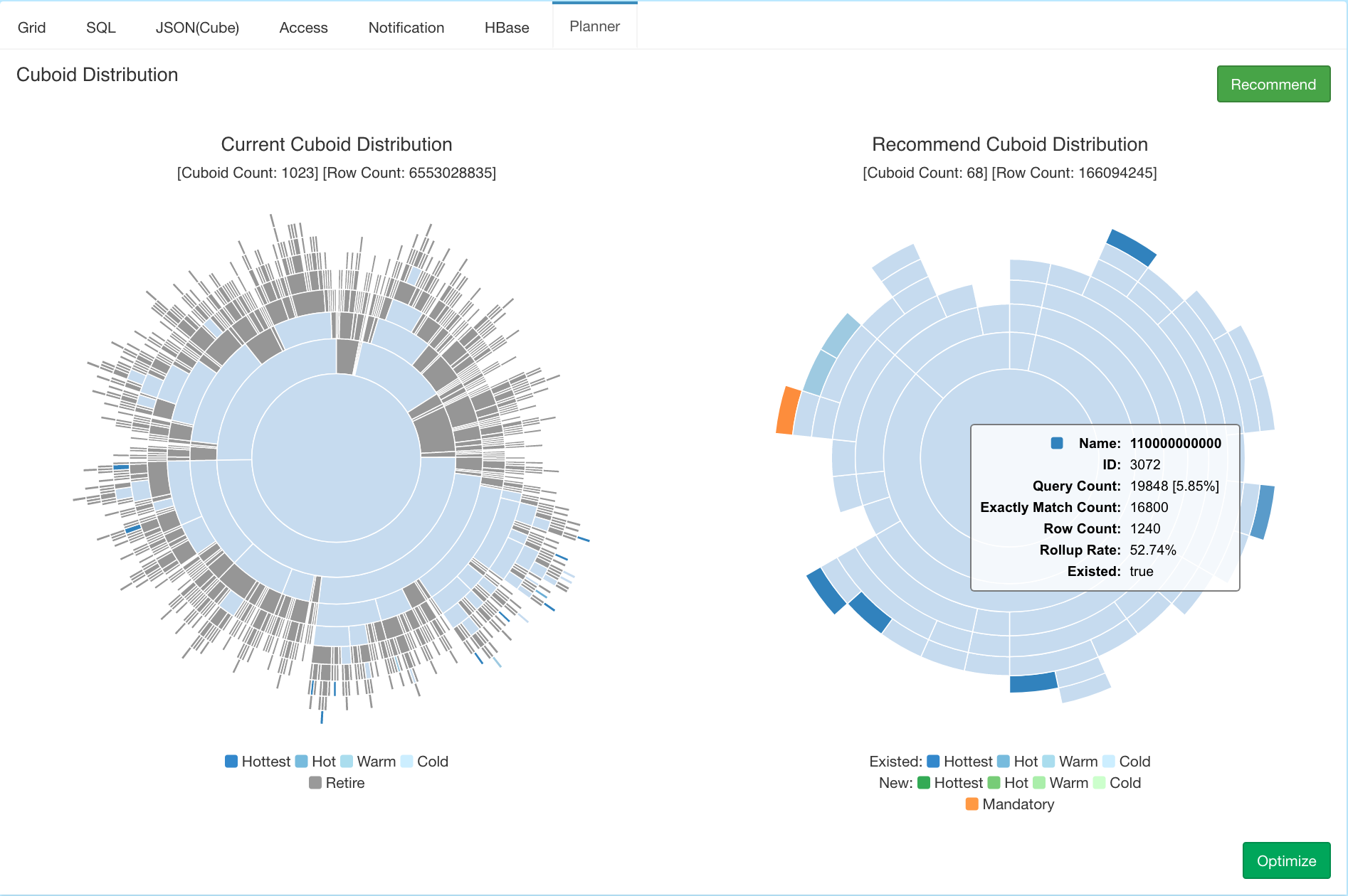
Interaction with a sunburst chart is fast and convenient. The user is able to focus on any cuboid and its children with just one click, and the view changes automatically, like from the left chart to the right chart below.


If you want to specify the parent of a leaf, click on the center circle (the part marked yellow).

Summary
In short, leveraging sunburst charts as OLAP cuboid visualizations introduces a creative way to discover cube insights down to the cuboid level. With these insights, the cube owner is able to have a resource-efficient cube, thus make Apache Kylin more competitive as an OLAP engine on Hadoop.
References
- ^Wikipedia contributors, “OLAP cube,” Wikipedia, The Free Encyclopedia, https://en.wikipedia.org/w/index.php?title=OLAP_cube&oldid=758240631 (accessed April 11, 2017).
- ^Gray, Jim; Bosworth, Adam; Layman, Andrew; Pirahesh, Hamid (1996). “Data Cube: A Relational Aggregation Operator Generalizing Group-By, Cross-Tab, and Sub-Totals“. Proceedings of the International Conference on Data Engineering (ICDE). pp. 152–159.
- ^“Just What Are Cubes Anyway? (A Painless Introduction to OLAP Technology)“. Msdn.microsoft.com. Retrieved 2012-07-25.
Some graphics copyright Apache Kylin